")
a little of this & a little of that.
all things design, aesthetic pretties and behind the curtain in our hyperfixations.


the so good blog
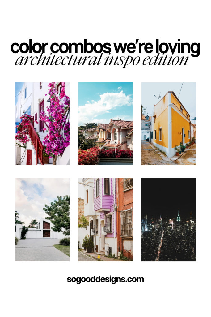
Color Combos we’re loving!
Growing up, my father was an electrician in NYC my entire childhood. He would work on new department stores downtown, and at least once a month he would come home with a new shirt for me from one of the stores that they were wrapping up on.
Normally this would be nightmarish for a preteen girl, but he was actually amazing at picking out colors he knew I would like and somehow had badass taste when it came to surprising me with clothes lol.
When I was 13, he came home one day with a shirt that had horizontal color block stripes. It was a blend of deep green, rust orange, coal black, beige and white. It was my absolute favorite shirt in the world… and I wore it all the time.
Once day I came home to my mother in our back living room on a ladder painting the walls. Turns out she was staring at my favorite shirt on the top of the laundry basket that morning and then decided she wanted to re-decorate that backroom using the colors as the aesthetic, and was starting with the paint color and the wallpaper trip at the top of the walls (Hello 1996 design lol.)
I remember thinking that was absolutely random and also impressive, and in that memory alone there was a seed planted to pay attention to the design inspiration around me.
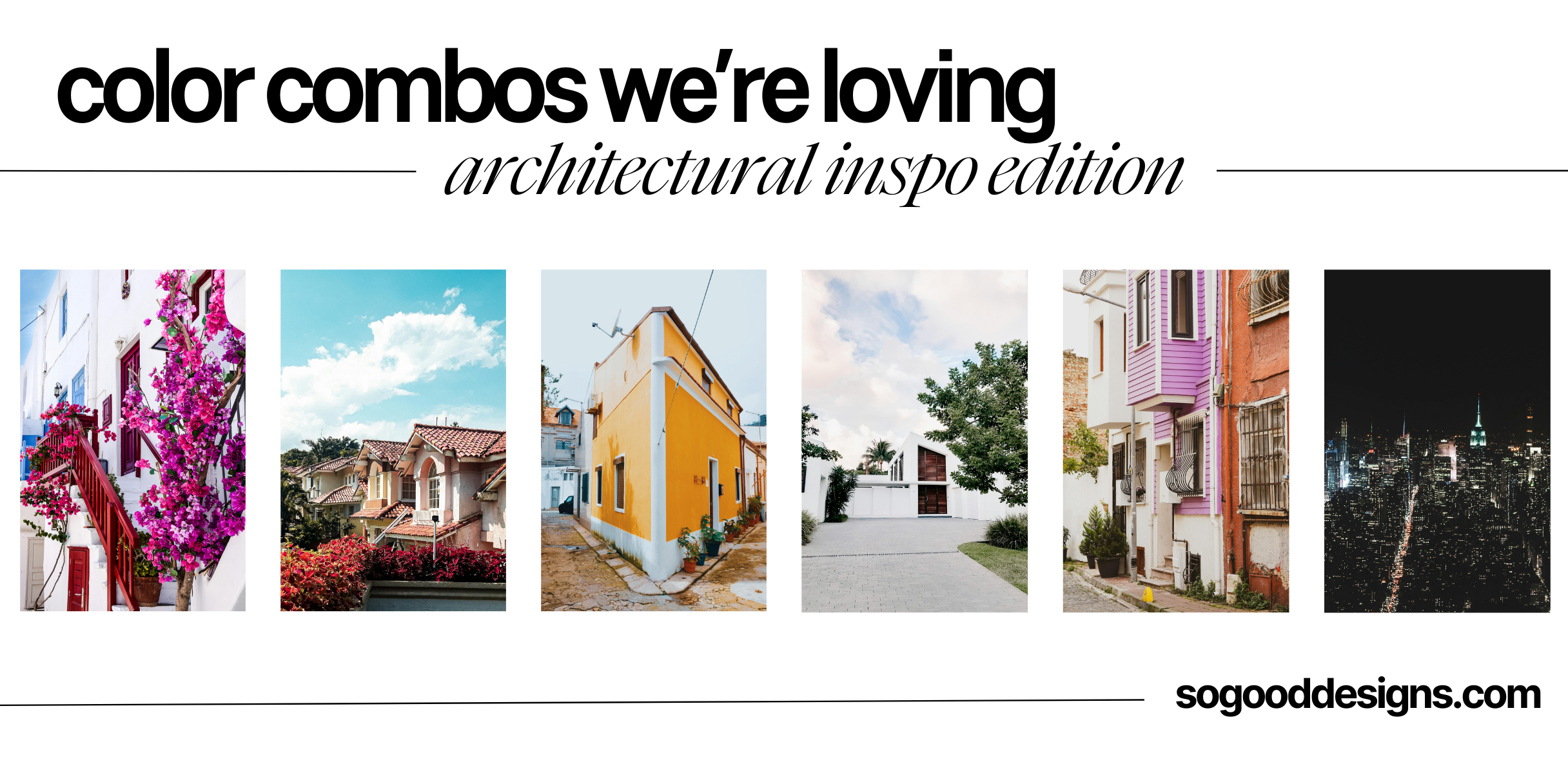
Yesterday I was sourcing some website design stock photos on Pexels, and came across an architectural category and got to scrolling.
AND OF COURSE, I saved some of my favorites so I could map out some color palettes I loved within the pictures to propose to future clients who are also in need of branding! I shared them on my IG as well if you’re more of a bookmark gal!
Take a look at these beauties:

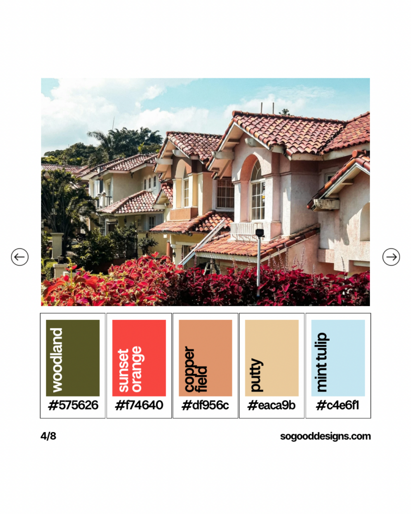
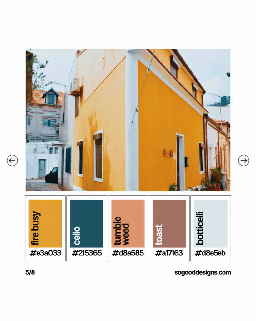
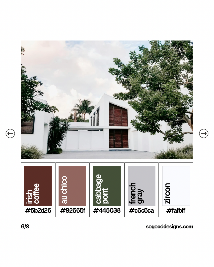
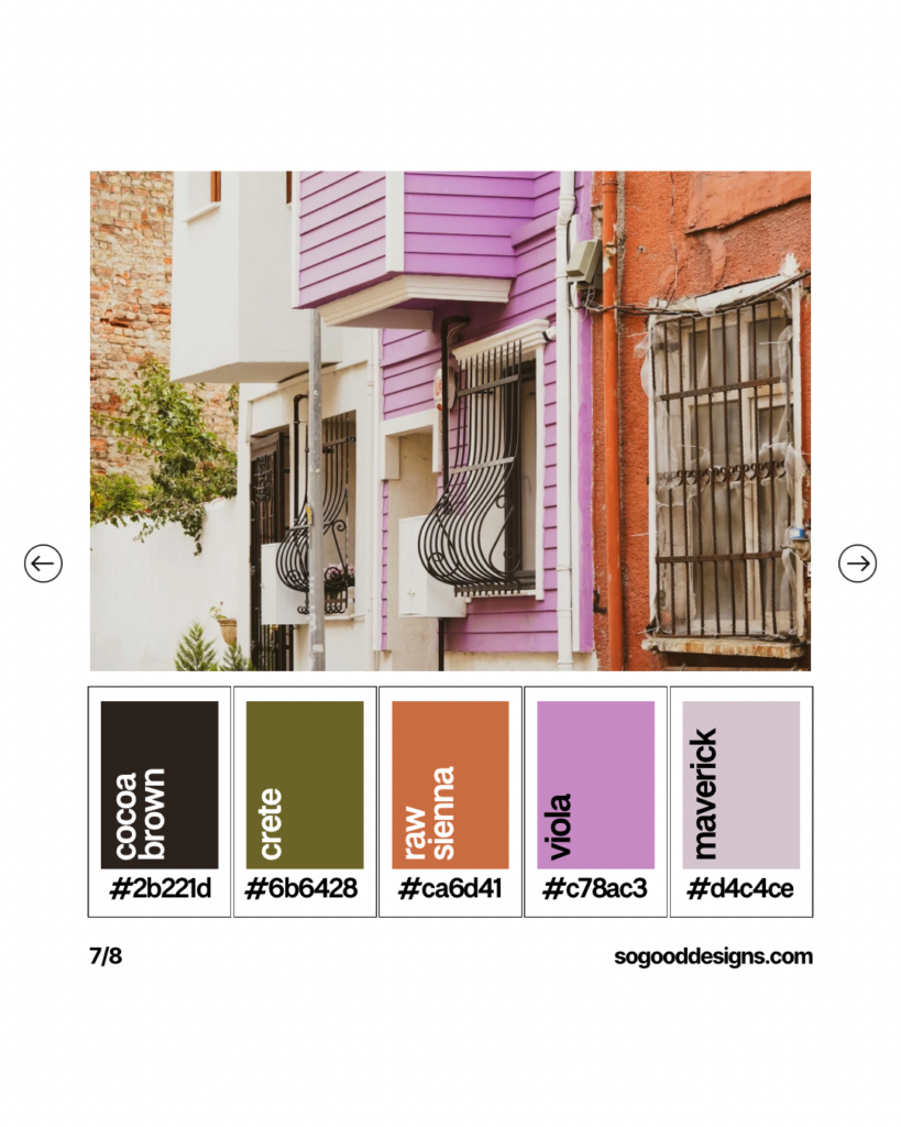
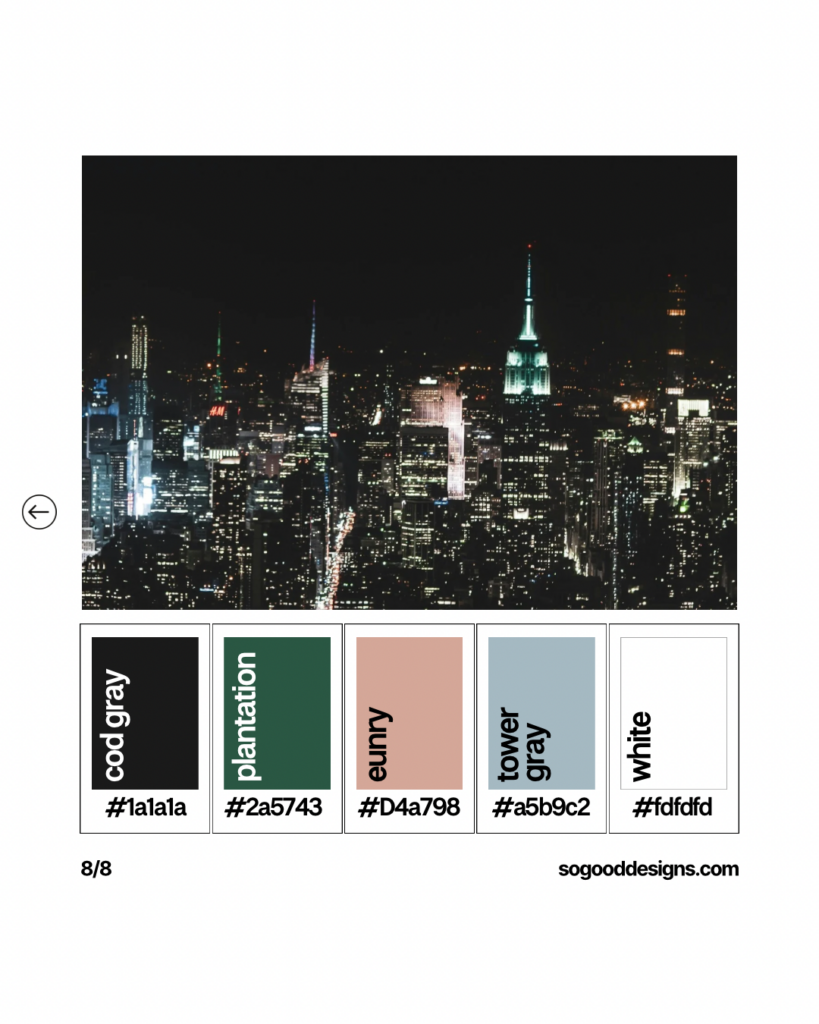
That last one really reminded me how simple it is to pull inspiration from even seemingly simple pictures, architecture and building cityscapes!
Cityscapes are a treasure trove of color inspiration for designers. From the vibrant street art that decorates urban walls to the varied shades of buildings and the dynamic play of light and shadow, cities offer endless possibilities for discovering new color combinations.
The materials, paint, and even the age of the structures can provide a diverse array of colors. Modern skyscrapers might showcase sleek metallics and glass, while older buildings could offer weathered bricks and painted wood. This mix of new and old can inspire unique color combinations.
Especially at night, cities come alive with neon lights and illuminated billboards. The bright, glowing colors against the dark sky can create dramatic and eye-catching palettes perfect for high-energy designs.
By exploring urban environments with an eye for color, you can continuously find fresh and innovative combinations to incorporate into your projects. These urban adventures not only boost your creativity but also ensure your designs stay modern and relevant. So, next time you’re in the city, take a moment to absorb the colors around you and let them inspire your next masterpiece.
Which of the six color palettes shared above are your favorite?! I am in love with the 4th if I’m being honest which I wish I cared more about color pops but I am SUCH a sucker for that color palette.
I hope you’re finding beautiful inspiration all around you my friend!
Let’s chat over on Instagram, and if you’re in the market for a new website I would be honored to come together to create the website of your dreams together!
xo Katie of So Good Designs
June 10, 2024


create
magic
with SO GOOD Designs

I'm ready if you are!
Complete this design application and we will get this show on the road.

