")
a little of this & a little of that.
all things design, aesthetic pretties and behind the curtain in our hyperfixations.


the so good blog
Some So Good Clean Font Pairings to Elevate Your Brand
Your brand’s typography can set the tone for everything—from a website’s feel to the way your audience perceives your message. But finding the right font pairings? That’s where many designers get stuck. Choosing complementary fonts isn’t just about aesthetics; it’s about creating balance, enhancing readability, and reinforcing your brand’s personality.
I’ve curated some clean and versatile font pairings to make things simple. They will help elevate your designs. Use them whether you’re working on websites, branding projects, or even marketing collateral.
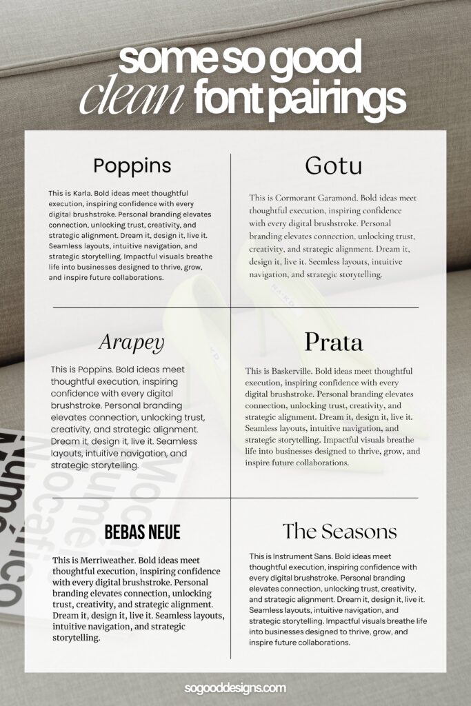
1. Poppins + Karla
This pairing is clean, modern, and perfect for creating a sleek, professional look. Poppins is geometric and rounded, making it ideal for headlines or headers, while Karla offers subtle character for body text without distracting the reader.
Where to use it:
- Creative agencies
- Tech startups
- Minimalist websites
✨ Pro Tip: Poppins works wonders for digital brands thanks to its clarity and versatility. Use Karla to provide a soft contrast.
2. Gotu + Cormorant Garamond
Looking for elegance mixed with simplicity? Gotu provides clean, approachable headlines, while Cormorant Garamond brings classic, sophisticated body text to life. This pairing works particularly well for brands that need a touch of luxury while staying approachable.
Where to use it:
- Fashion brands
- Boutique design firms
- Luxury goods
✨ Pro Tip: To emphasize sophistication, use Cormorant Garamond’s italic styles sparingly in subheadings or pull quotes.
3. Arapey + Poppins
This pairing brings together traditional and contemporary styles. Arapey is delicate and elegant, making it great for creating soft, romantic headlines. Poppins, once again, balances the look with its modern, clean lines.
Where to use it:
- Wedding or event planners
- Creative lifestyle bloggers
- Artistic portfolios
✨ Pro Tip: Arapey’s slight serif makes it perfect for print materials like invitations, but it can easily be adapted to web-based designs.
4. Prata + Baskerville
Prata exudes elegance and charm, while Baskerville adds timeless sophistication. This duo is ideal for brands that want a refined, classic feel.
Where to use it:
- High-end consulting firms
- Law firms or financial services
- Editorial brands
✨ Pro Tip: Prata shines when used for large headings and hero text, while Baskerville anchors the design with readable, structured paragraphs.
5. Bebas Neue + Merriweather
Bold and commanding, Bebas Neue grabs attention instantly. Paired with Merriweather, which provides excellent legibility, this duo works wonders for brands that need a strong, authoritative presence.
Where to use it:
- Construction companies
- Fitness brands
- Digital campaigns
✨ Pro Tip: Bebas Neue is ideal for headers, but be cautious about overusing it. Let Merriweather do the heavy lifting in body text for long-form content.
6. The Seasons + Instrument Sans
The Seasons introduces a playful, fresh vibe, while Instrument Sans offers structure and simplicity. Together, they create a dynamic, creative pairing that’s perfect for brands with a youthful, energetic spirit.
Where to use it:
- Modern cafes or restaurants
- Lifestyle brands
- Art and design websites
✨ Pro Tip: Use The Seasons to inject personality into key areas of your design, such as headings or quotes, and let Instrument Sans handle general readability.
Why Clean Font Pairings Matter
The right font pairing can do more than make your design look polished. It can:
- Build trust: Clean typography reflects professionalism and attention to detail.
- Enhance readability: Thoughtful combinations prevent visual overload.
- Reinforce your brand: Fonts are part of your brand identity, just like colors and imagery.
When choosing pairings, consider your brand’s personality and the message you want to convey. Clean fonts work especially well for brands that prioritize simplicity, elegance, and timeless design.
How to Implement These Pairings
Here’s how to make these font combinations work seamlessly across your brand assets:
- Website Design: Use one font for headers and the other for body text.
- Branding Collateral: Apply contrasting fonts to business cards, brochures, and presentations.
- Social Media Graphics: Create engaging visuals by mixing bold headers with clean, readable captions.
Final Thoughts: Choosing the Right Pairing for Your Brand
There’s no one-size-fits-all approach to font pairings, but the key is to create contrast while maintaining balance. These pairings are designed to give you a starting point, but don’t be afraid to experiment and adapt them to fit your brand’s unique needs.
Which pairing speaks to you the most? Comment below—I’d love to hear your thoughts on how you’d use them!

January 31, 2025

create
magic
with SO GOOD Designs

I'm ready if you are!
Complete this design application and we will get this show on the road.

_(2)")