")
a little of this & a little of that.
all things design, aesthetic pretties and behind the curtain in our hyperfixations.


the so good blog
Logo Design Challenge Week One: Inspiration, Process & Key Takeaways
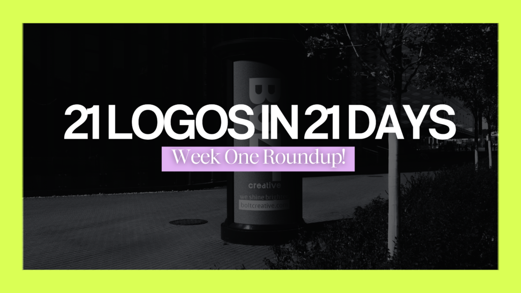
Logo Challenge Roundup: Week One
Over the past seven days, I’ve been deep in the world of design, taking on a self-imposed challenge to create a new logo every day for 21 days. Now that I’ve wrapped up week one, I wanted to share a little behind-the-scenes look at each design, along with some lessons I’ve learned along the way. Let’s dive in!
Day One: Olive & Sage Wedding Planning
Business Type: Wedding Planning Service
Target Market: Brides and grooms seeking elegant, stress-free weddings
Design Style: Sophisticated, soft tones with floral and natural accents
This one was right up my alley because I love a delicate and elegant aesthetic. I made some changes to the ampersand because I felt like it needed more flow. The font I chose was a clean serif that would look beautiful on graphics as well as in print.
I also created a logomark using the ‘O’ from Olive and layered it with the offset path feature to link and overlap them, resembling two wedding rings—a subtle nod to the symbolism of two people building a life together. This logo ended up feeling timeless, romantic, and perfectly suited for the industry.
You can watch a video of my design process on my Instagram here:
Day Two: Wildwood Candle Co.
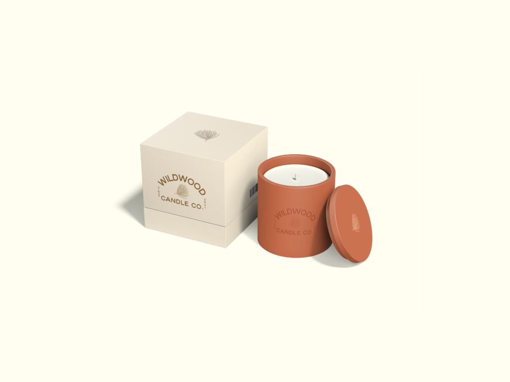
Business Type: Handcrafted Candle Brand
Target Market: Home decor lovers and wellness enthusiasts
Design Style: Earthy, rustic with hand-drawn botanicals and natural tones
I’m a huge candle lover, but admittedly, I avoid ones with crazy labels since they sit out in my home. I kept that in mind when designing this one. I used a rustic font that really spoke to me and made some custom adjustments to certain letters. For the icon, I found a simple pinecone image (via a free licensed website) and traced it for reference, then freehanded the finer details.
I loved how this one came out—it’s clean, cozy, and the kind of logo I’d proudly display on my own shelves.
You can watch a video of my design process on my Instagram here:
Day Three: Driftwood Surf Co.
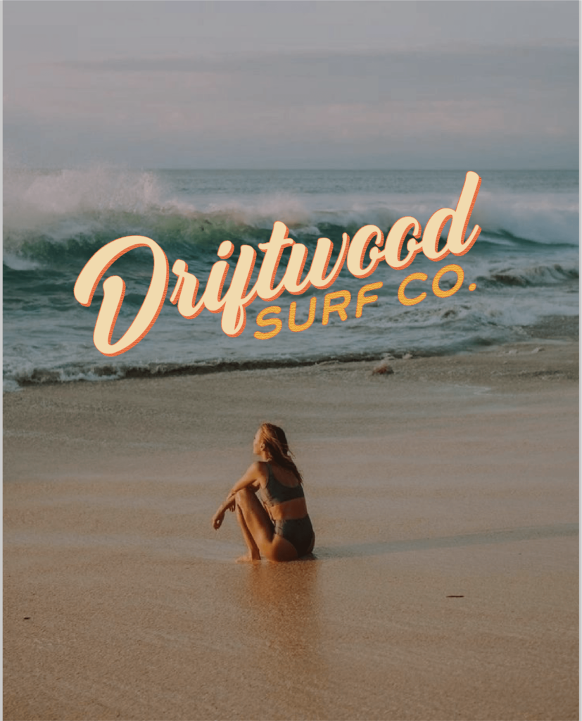
Business Type: Surf Shop and Lifestyle Brand
Target Market: Surfers, outdoor enthusiasts, and adventure seekers
Design Style: Laid-back, beachy design with earthy, ocean-inspired colors and hand-drawn elements
At first, I wasn’t sure which direction to go with the font. I eventually decided to make “Driftwood” feel like a beach shop with a laid-back, weathered look, while keeping “Surf Co” in a clean sans serif. I customized the font and tilted the entire logo for a breezy, carefree vibe.
For an alternate version, I designed a simple surfboard background to use on apparel or print materials. The colors, textures, and overall feel made this one of my favorites.
You can watch a video of my design process on my Instagram here:
Day Four: Starlight Bookstore
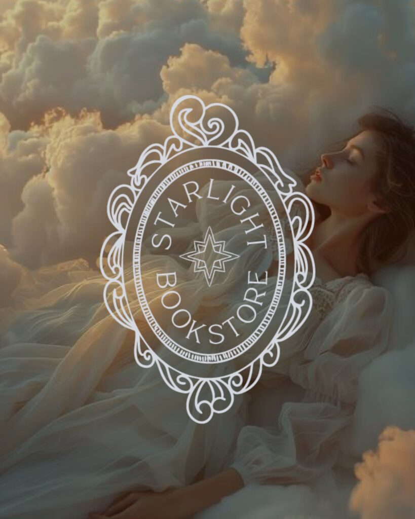
Business Type: Independent Bookshop
Target Market: Book lovers, students, and local readers
Design Style: Nostalgic and whimsical with vintage fonts and storybook-like charm
This was such a fun challenge because it pushed me outside my usual minimalist style. I love clean, sans serif fonts, so creating something whimsical required some research. After some Pinterest inspiration, I found an ornate mirror frame that sparked the idea.
I hand-drew a frame with a monogram “SB” inside, using the pathfinder tool to link the letters together. Then, I created a circular logo variation using the Type on Path tool and added a delicate, hand-drawn star at the center. The result was dreamy, nostalgic, and perfect for a cozy bookstore.
You can watch a video of my design process here:
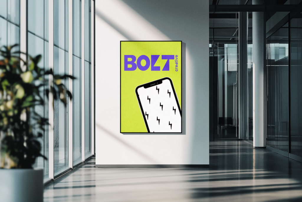
Day Five: Bolt Creative Agency
Business Type: Digital Marketing Agency
Target Market: Small businesses and startups needing creative content
Design Style: Sleek, modern, with bold typography and dynamic iconography
This one was a blast! I wanted something funky and bold to reflect the brand’s creative vibe. As I played with the letters, I realized I could shape a lightning bolt between the ‘L’ and ‘T’ in “Bolt.”
Once I nailed the icon, I let the logo do the rest. The color palette was intentionally vibrant and a bit unconventional—like a creative agency that’s not afraid to take risks. The finished product felt like the visual equivalent of a jolt of inspiration.
You can watch a video of the design process here:
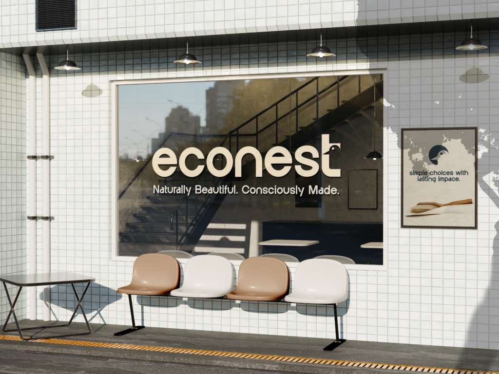
Day Six: EcoNest Homegoods
Business Type: Sustainable Home Goods
Target Market: Eco-conscious homeowners
Design Style: Minimalist, earthy design with natural textures and clean lines
This design was a dream because I’m a sucker for minimalist design. I chose a simple sans serif font to convey a clean, sustainable vibe. For the icon, I experimented with adding a small bird head cutout in the letter ‘T.’
I then extracted the bird shape and placed it within a circular mark, creating a versatile logo icon. Paired with a neutral, earth-toned color palette, the final design felt both modern and inviting.
Watch a video of the design process here:
Day Seven: Sol Kitchen Food Truck

Business Type: Food Truck
Target Market: Food lovers of all ages, drawn to classic American cuisine with a fresh twist
Design Style: Bold, vibrant, and playful
This logo was all about fun! I went with a lively, chunky font for “SOL” and added sun rays around the ‘O’ as a playful nod to the name. Next, I illustrated a pizza, donut, and soda cup to showcase the variety of comfort foods served from the truck.
The color palette was bright and eye-catching—perfect for a food truck that people notice from a mile away. It was quirky, energetic, and definitely outside my typical style, which made it extra fun to create.
Watch the video of this design process here:
Reflections After Week One
This challenge has already taught me so much. As a newer brand designer, I’ve realized how much faster I can make decisions when I’m not overthinking everything. Design often invites perfectionism, and sometimes that can stall the creative process. But with a daily deadline, I’ve had to trust my instincts more—and it turns out my instincts aren’t so bad after all.
Another big takeaway? The value of exploring different aesthetics. As designers, we often get clients with varying tastes, and if we stay stuck in our personal style, we risk missing the mark for their target audience. This challenge has pushed me to try styles that aren’t my go-to, which makes me a more versatile designer.
Lastly, I’m excited to use these logos as a style reference for future clients. When someone says, “I want something earthy,” or “I like a more whimsical look,” I can point them to one of these daily logos as a tangible example.
Why I’m Doing the 21-Day Logo Challenge (and Why You Should Too!)
I decided to take on this 21-day challenge to push myself creatively and break free from design perfectionism. It’s easy to get stuck overthinking choices, but when you commit to creating a logo every day, you learn to trust your instincts and make confident decisions.
For any designer, whether you’re new to branding or a seasoned pro, this challenge offers incredible benefits: you’ll explore different styles, sharpen your skills, and build a diverse portfolio in the process. Plus, it’s a fantastic way to stay creatively energized.
I’m genuinely so excited to see what other designers come up with. Creativity is contagious, and seeing how others interpret the same prompts in their own style will be so inspiring. If you decide to join in, don’t forget to tag me—I can’t wait to celebrate your work alongside mine!
That’s a wrap on week one—can’t wait to see where the next 14 days take me! 🎨✨
Want to join the 21 Day Logo Challenge?!
February 17, 2025

create
magic
with SO GOOD Designs

I'm ready if you are!
Complete this design application and we will get this show on the road.

_(2)")