a little of this & a little of that.
all things design, aesthetic pretties and behind the curtain in our hyperfixations.
the so good blog
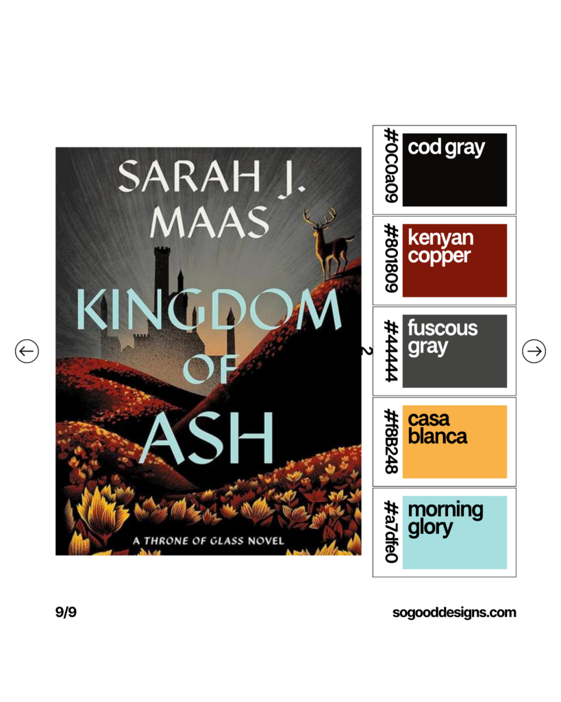
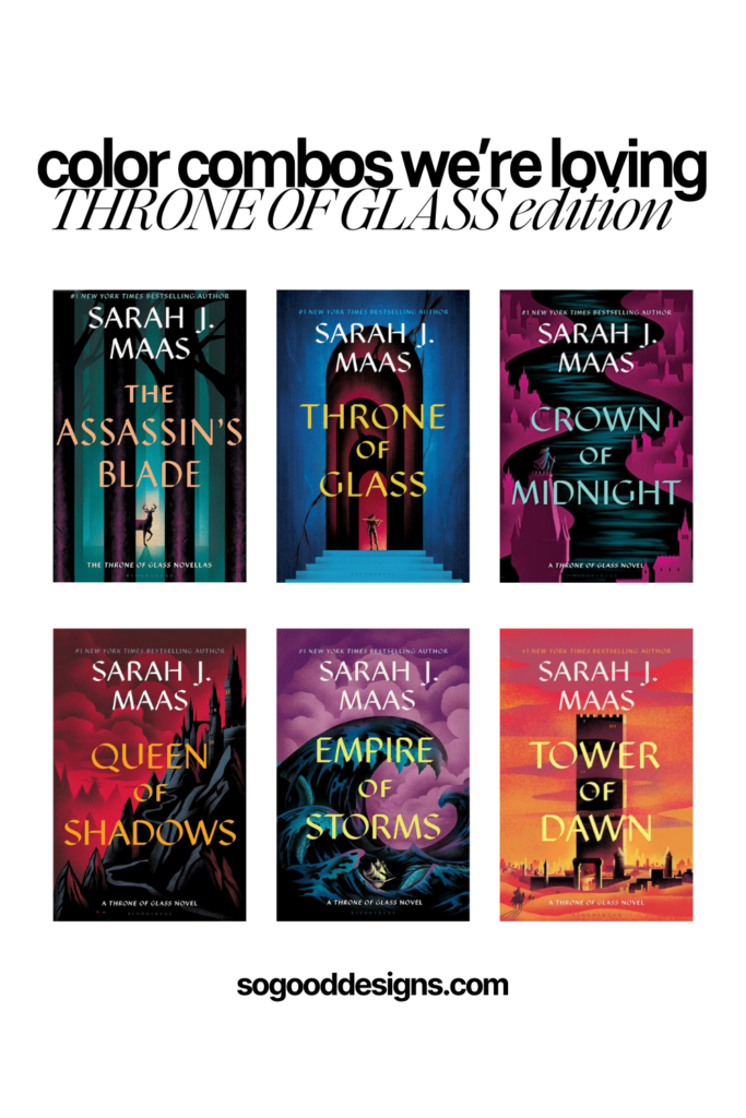
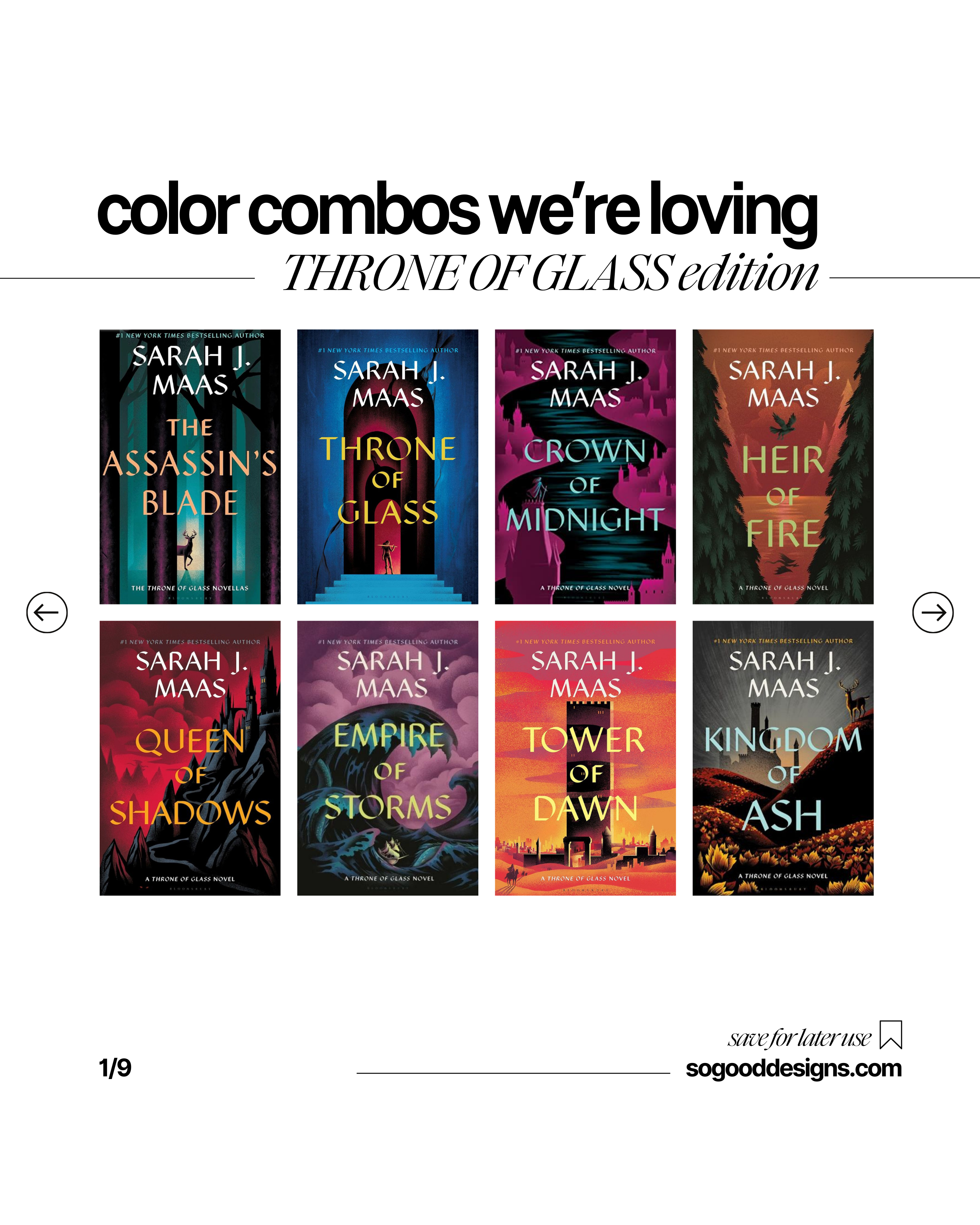
Throne of Glass Inspired Color Palettes
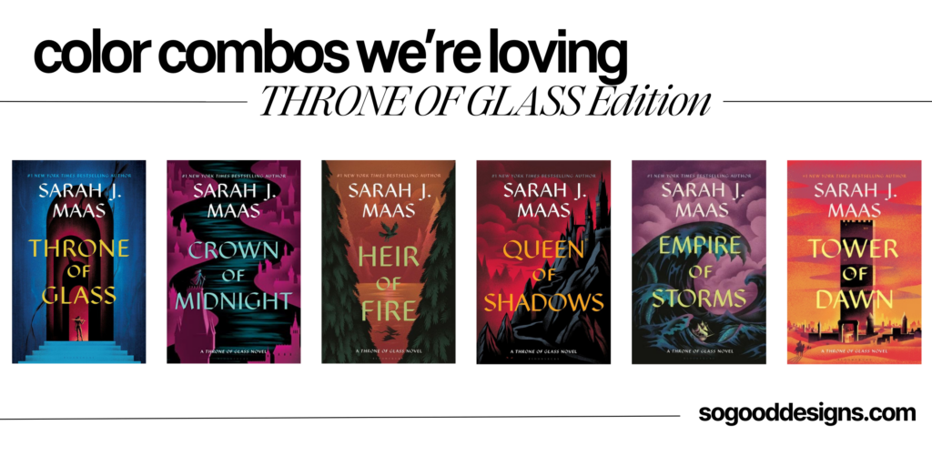
Funny story about the Throne of Glass book series (which I am currently OBSESSED with) is that I was given the first book in 2020, and it sat on my shelf for four years because I didn’t love the cover font or imagery.
It wasn’t until a friend read the series earlier this year and told me I had to go get it, was that I realized I already owned the first book and I swallowed my pride and cracked it open despite the typology making me want to hurl it across the room.
I don’t know if these beautiful covers even existed in 2020, but it just goes to show that some maniacs that are aesthetic driven monsters like me, will skip out on something amazing if the feel of the brand isn’t hitting for them!
After I breezed through the first book, I ran my can to the closest local book store and got the entire series with these beautiful covers.
I stare at them on my shelf often, and the reason is because not only do I adore the font (which I found here and will never use but love to stare at it) but the color palette of each book are stunning!
So much so that I wanted to make sure to capture them so I could use them in the future on branding projects if the vibe fits, and I wanted to make sure to share with anyone else who may be simply VIBING with these beautifully moody, yet cool color combinations like I am!
Are you looking for help on a branding project or a new website for your business? I would be honored to help! Make sure to checkout So Good Designs and reach out if you need a customized service that you don’t see listed!
xo Katie @ So Good Designs
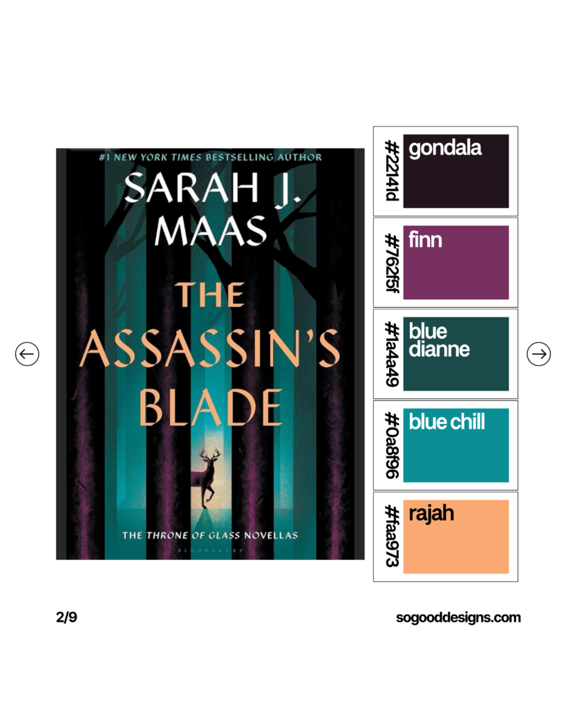
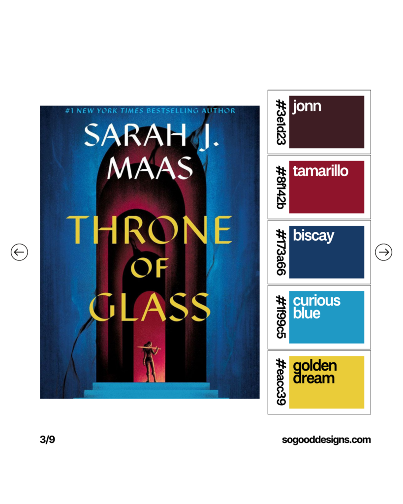
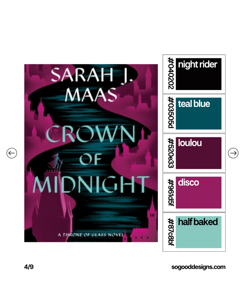
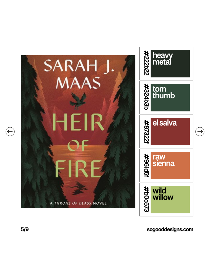
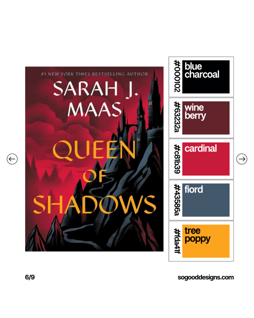
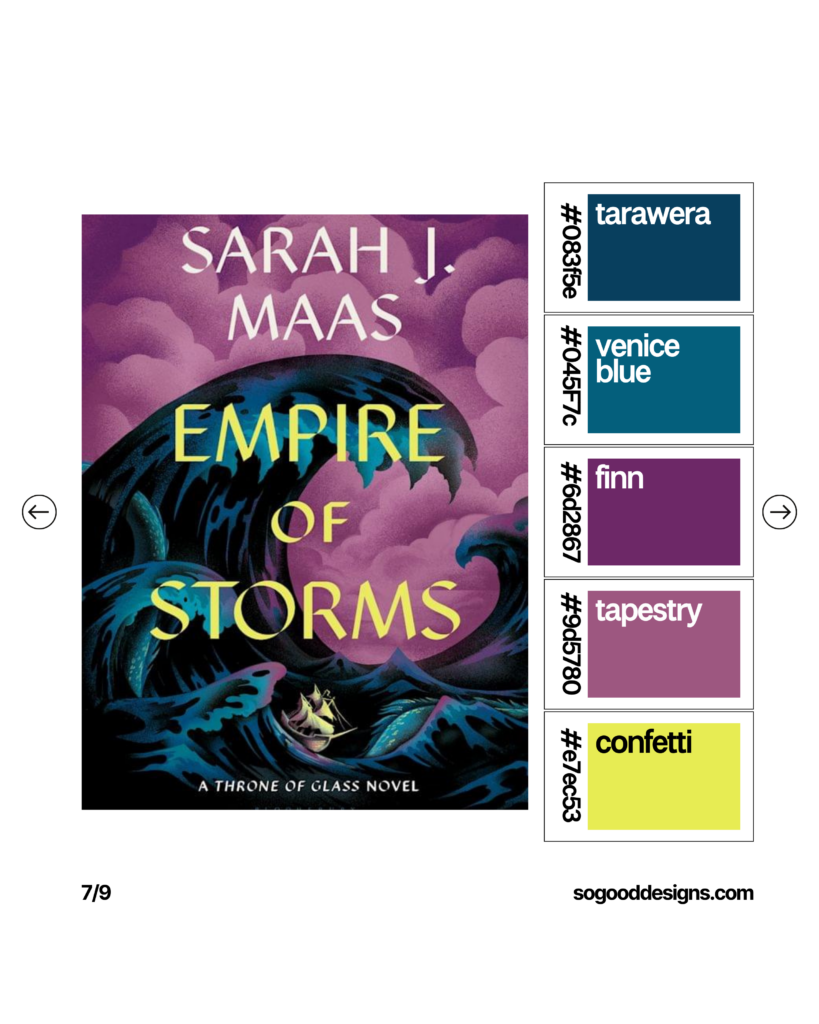
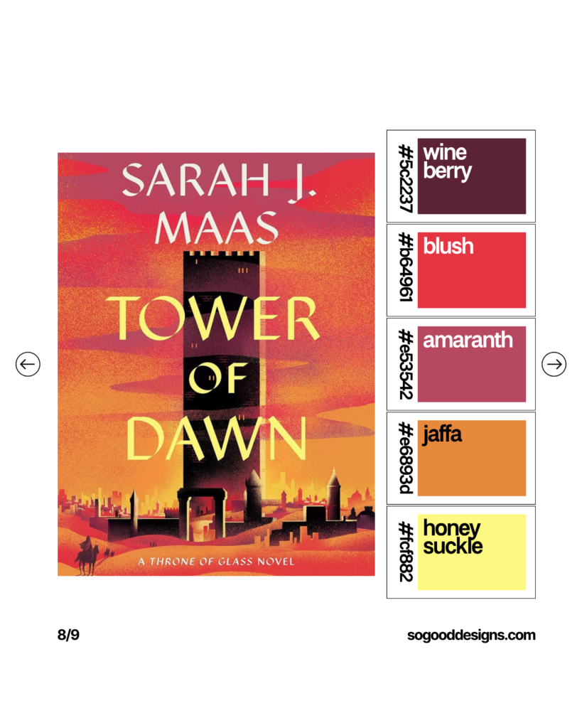
When embarking on the journey of creating a brand, one of the most crucial elements to consider is the color palette. Colors evoke emotions, set the tone, and make your brand instantly recognizable. But where can you find inspiration for your color scheme? Look no further than the everyday objects around you, such as book series covers.
Why Book Covers?
Book covers are a treasure trove of design inspiration. Designers meticulously select colors to capture the essence of the story and attract potential readers. This makes them a perfect source of inspiration for your branding.
Step-by-Step Guide to Finding Inspiration:
Visit Your Local Bookstore or Library: Head to the nearest bookstore or library and take a leisurely stroll through the aisles. Pay close attention to book series covers. These covers are often designed to be cohesive, making them a great example of how colors can work together harmoniously.
Observe the Color Combinations: Notice the primary colors used on the covers. How do they make you feel? Are they vibrant and energetic, or soft and calming? Take note of how different colors are paired together and how they complement each other.
Consider the Mood and Genre: Different genres often have distinct color palettes. For example, romance novels might use soft pastels, while thrillers could feature dark, moody hues. Think about the mood you want to convey with your brand and look for covers that evoke similar feelings.
Take Photos or Notes: Capture photos of the covers that catch your eye or jot down the color combinations in a notebook. This will help you remember your favorite palettes and give you a reference point when you’re ready to create your own.
Use Digital Tools: There are many online tools available, like Adobe Color or Canva’s Color Palette Generator, where you can upload your photos and extract the color schemes. This makes it easy to see how the colors from the book covers can be translated into your brand.
Applying Your Inspiration
Once you’ve gathered your color inspiration, it’s time to apply it to your brand. Consider how these colors will work across various elements like your logo, website, and marketing materials. Consistency is key to creating a cohesive brand identity.
Final Thoughts
Finding color palette and branding inspiration doesn’t have to be a daunting task. By looking at everyday objects like book series covers, you can discover a world of beautiful and effective color combinations. So next time you’re in need of inspiration, remember to take a closer look at the things around you – you might just find the perfect palette for your brand!
This approach simplifies the process and makes finding color inspiration a fun and creative exercise. Happy branding!
June 21, 2024
create
magic
with SO GOOD Designs
I'm ready if you are!
Complete this design application and we will get this show on the road.